Interior design studio
Interior design studio
Interior design studio
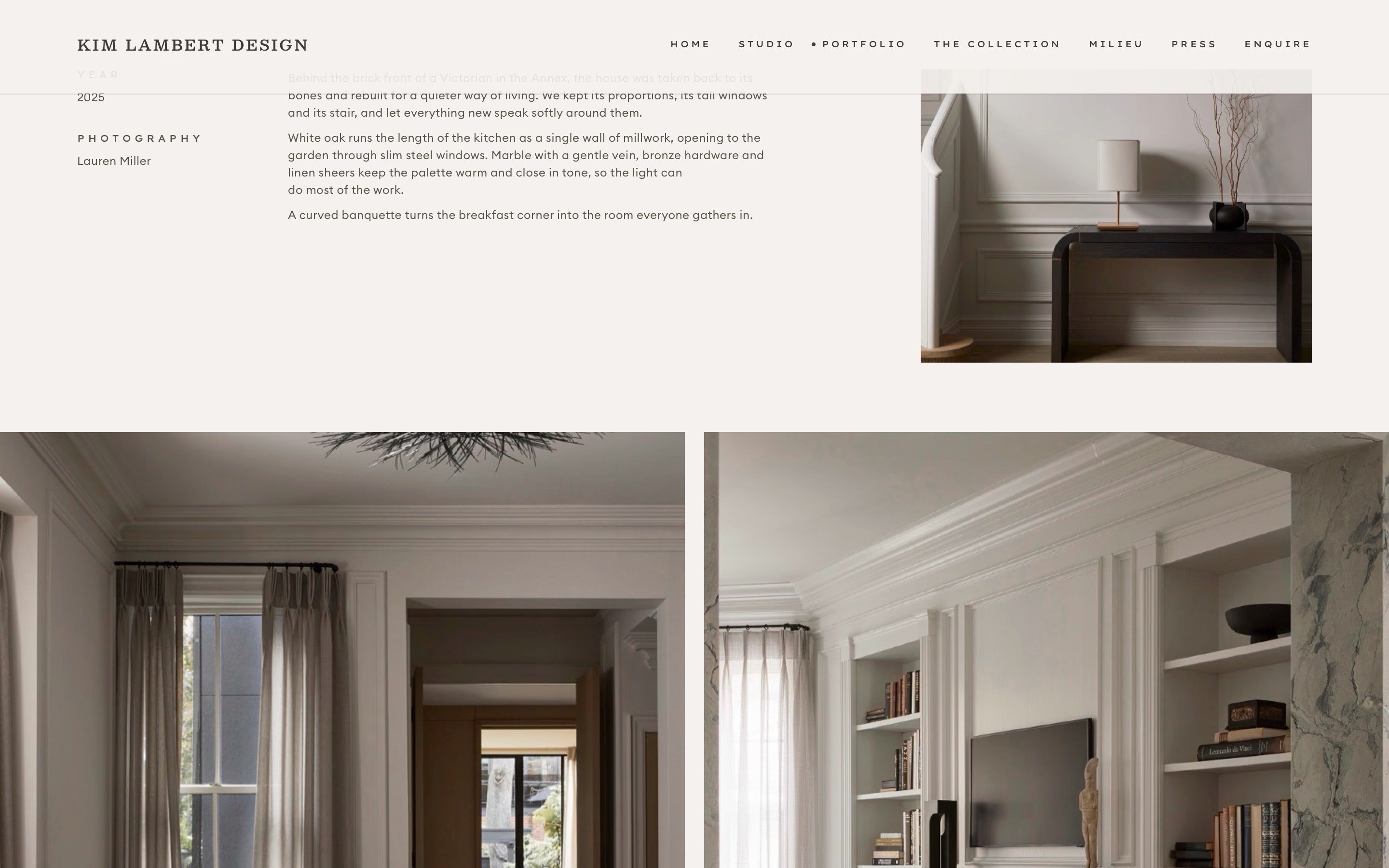
A portfolio for a Toronto interior design studio whose rooms are calm, warm and exact. The site had to feel the same.
Client
High-end interior design studio, Toronto
What
Website, art direction, CMS, custom code
Platform
Framer
Built
2026
The brief
The client runs a celebrated, full-service interior design studio: custom homes and bespoke furniture for clients who notice everything. The site had to read like her rooms, with every photograph shown at its best, every photographer credited, and nothing on the page that didn’t need to be there.
The client runs a celebrated, full-service interior design studio: custom homes and bespoke furniture for clients who notice everything. The site had to read like her rooms, with every photograph shown at its best, every photographer credited, and nothing on the page that didn’t need to be there.

What was built
Thirty-seven pages: Studio, Portfolio, The Collection, Milieu (her journal), Press and Enquire. Nineteen projects, eleven journal stories, twenty-four press features, her team and her furniture line live in eight CMS collections, so the client edits and publishes the site herself.
Thirty-seven pages: Studio, Portfolio, The Collection, Milieu (her journal), Press and Enquire. Nineteen projects, eleven journal stories, twenty-four press features, her team and her furniture line live in eight CMS collections, so the client edits and publishes the site herself.
Forty-five redirects keep every old address working.
Forty-five redirects keep every old address working.


Under the hood
Custom code where Framer stops: a masonry journal gallery with a full-screen viewer you can swipe through, a home carousel that loads one photograph at a time instead of twenty, and an enquiry menu styled to match the site.
Custom code where Framer stops: a masonry journal gallery with a full-screen viewer you can swipe through, a home carousel that loads one photograph at a time instead of twenty, and an enquiry menu styled to match the site.
775 original photographs were audited and served as WebP at the size each screen needs. A live Instagram feed, structured data for search and a sitemap in Google Search Console.
775 original photographs were audited and served as WebP at the size each screen needs. A live Instagram feed, structured data for search and a sitemap in Google Search Console.

Why it works
Three typefaces, off-black ink on cream and one idea for motion: everything fades up 24 pixels, hairlines draw themselves and photographs push in 2% on hover. Phones and iPads get layouts of their own while the desktop stays exactly as designed, and every page is checked in Safari and Chrome at real window sizes.
Three typefaces, off-black ink on cream and one idea for motion: everything fades up 24 pixels, hairlines draw themselves and photographs push in 2% on hover. Phones and iPads get layouts of their own while the desktop stays exactly as designed, and every page is checked in Safari and Chrome at real window sizes.

One layout, three breakpoints: desktop, tablet and phone in Framer.